Key Takeaways
- Intuitive design of follow and subscribe screens enhances user engagement and retention.
- Clear and concise calls-to-action (CTAs) are essential for guiding user behavior.
- Personalization and timely prompts can increase subscription rates.
- Accessibility considerations ensure inclusivity for all users.
- Regular testing and iteration based on user feedback lead to continuous improvement.
In today’s digital landscape, engaging users effectively is critical for mobile app longevity and user satisfaction. The screens dedicated to following and subscribing act as pivotal gateways for users to connect with content and communities. When these interfaces are intuitive and seamless, users feel more inclined to interact and return to the app. An effective follow button is no longer just a convenience but a strategic tool for fostering ongoing engagement and loyalty.
As competition for user attention intensifies, developers must carefully consider every aspect of the user experience. Well-designed follow and subscribe screens help users receive updates and access relevant content easily, encouraging them to engage more deeply with the app’s offerings. Emphasizing clarity, accessibility, and personalization in these designs can make a profound difference in user retention and app growth.
Understanding User Expectations
Users expect navigation in mobile apps to be instinctive and straightforward. Modern mobile users are accustomed to interfaces where actions like following or subscribing require minimal effort or learning curve. Research published by Nielsen Norman Group outlines that mobile navigation must minimize cognitive load and guide users effortlessly. When follow and subscribe screens obey these usability tenets, the risk of user frustration and abandonment is dramatically reduced.
If a user has to guess how to subscribe or follow, the likelihood of a completed action drops. Aligning these screens with established user patterns and behaviors is essential. For this reason, designers should prioritize standard placements, recognizable icons, and contextual cues that align with the flow of the app.
Designing Clear Calls-to-Action
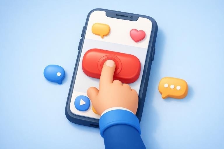
Calls-to-action serve as signposts guiding users toward the intended interaction. To maximize conversion, CTAs should be unambiguous, visually distinct, and promptly noticeable. For example, YouTube utilizes a brightly colored ‘Subscribe’ button that stands out against the interface, often accompanied by animations or prompts from the creator, drawing immediate attention to the intended action. Best practices suggest the use of short, action-driven phrases such as “Follow Now” or “Get Updates,” which communicate exactly what will happen next.
Placement is equally important. Buttons should be situated where users naturally pause or seek interaction, such as at the end of an article, below a profile picture, or within content feeds. This strategic positioning reduces friction and encourages higher engagement rates.
Personalization and Timing
Personalization significantly lifts the performance of follow and subscribe screens. By analyzing patterns in user activity—such as content preferences, session duration, or topics of recurring interest—apps can surface subscription prompts when users are most receptive. An effective example is Google Play’s topic pages, which present users with follow or subscribe options precisely as they browse related subjects. This relevance makes users more likely to take action, as the suggestions feel tailored rather than generic.
Timing also plays a crucial role. Subscription prompts that appear after a user has engaged with multiple pieces of related content are more likely to yield affirmative responses than generic pop-ups shown immediately upon app launch.
Ensuring Accessibility
Every user, regardless of ability, should be able to interact with follow and subscribe features. Accessibility begins with basic compliance—buttons should be large enough to tap, have sufficient contrast, and provide alternative text for users relying on screen readers. The Web Content Accessibility Guidelines (WCAG) elaborates on criteria such as keyboard accessibility and readable labels, which are crucial in ensuring no one is excluded.
Incorporating accessibility is not merely a regulatory or ethical consideration. It expands your user base and reinforces positive sentiment around your brand. Features like focus states, logical tab ordering, and descriptive hints can all contribute to an inclusive design that supports users of varying abilities.
Testing and Iteration
The pathway to optimizing follow and subscribe screens lies in continuous improvement and adaptation. Regular A/B testing enables developers to validate design hypotheses and discover what resonates with users. Key metrics such as click-through rate, conversion percentage, or time-to-task completion shed light on bottlenecks or friction points. As seen with platforms like Substack, which recently unveiled a TikTok-inspired video feed to make content exploration and following creators more engaging, testing and incremental adjustments are critical for staying aligned with evolving user preferences.
Gathering and responding to user feedback further strengthens this process. Direct input uncovers pain points or missing features, while analytics-based insights help prioritize the most impactful enhancements. A culture of experimentation enables teams to stay responsive and user-centered in their design approach.
Conclusion
Crafting follow and subscribe screens that are user-friendly and intuitive is an ongoing process requiring careful attention to design, accessibility, and behavioral cues. By understanding user expectations, crafting compelling CTAs, personalizing prompts, ensuring equitable access, and embracing iterative development, mobile apps can create inviting pathways for meaningful engagement. As competition grows fiercer in the app marketplace, these thoughtful design choices will distinguish your platform and drive sustained user loyalty.

